Colour, without the fear. Combinations that feel like home.
Most of us admire colour in other people’s homes, then paint our own walls off-white, just to be safe. Colour doesn’t have to feel risky. One easy rule, a little attention to undertones and light, and a few tried and trusted combinations make it simple to choose colours you’ll love living with, room by room.
Start with what stays
Before you open a shade card, look down. The floor tiles, the marble on the stairs, the wooden doors and the sofa you’re keeping will sit beside your new colours for years. They already have colours of their own, and the walls should get along with them.
Notice whether those fixed things lean warm or cool. Beige vitrified tiles, teak doors and brass fittings lean warm. Grey granite, white marble with grey veins and steel lean cool. A wall colour from the same family will feel settled. One from the opposite family can work too, as long as you choose the contrast on purpose.
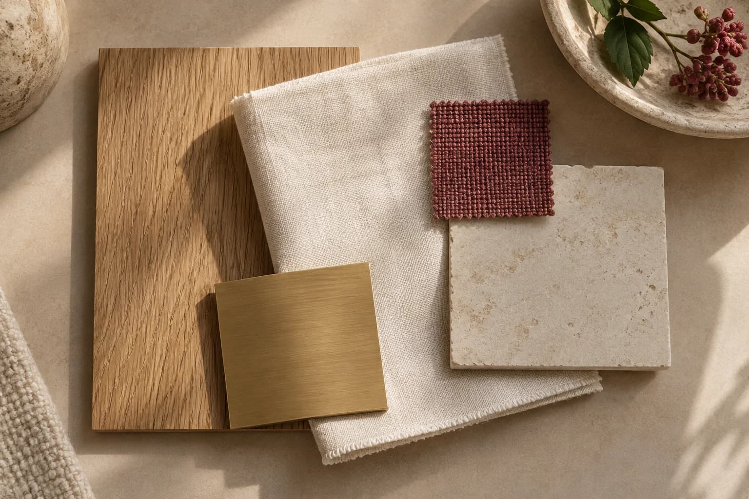
Keep a little bag of evidence: a spare tile, a cushion cover, a photo of the curtains in daylight. Carry it to the paint shop and hold every chip against it. If you’re choosing wood, stone and fabrics at the same time, our guide to building a material palette sits nicely beside this one.
The 60-30-10 colour rule, and when to bend it
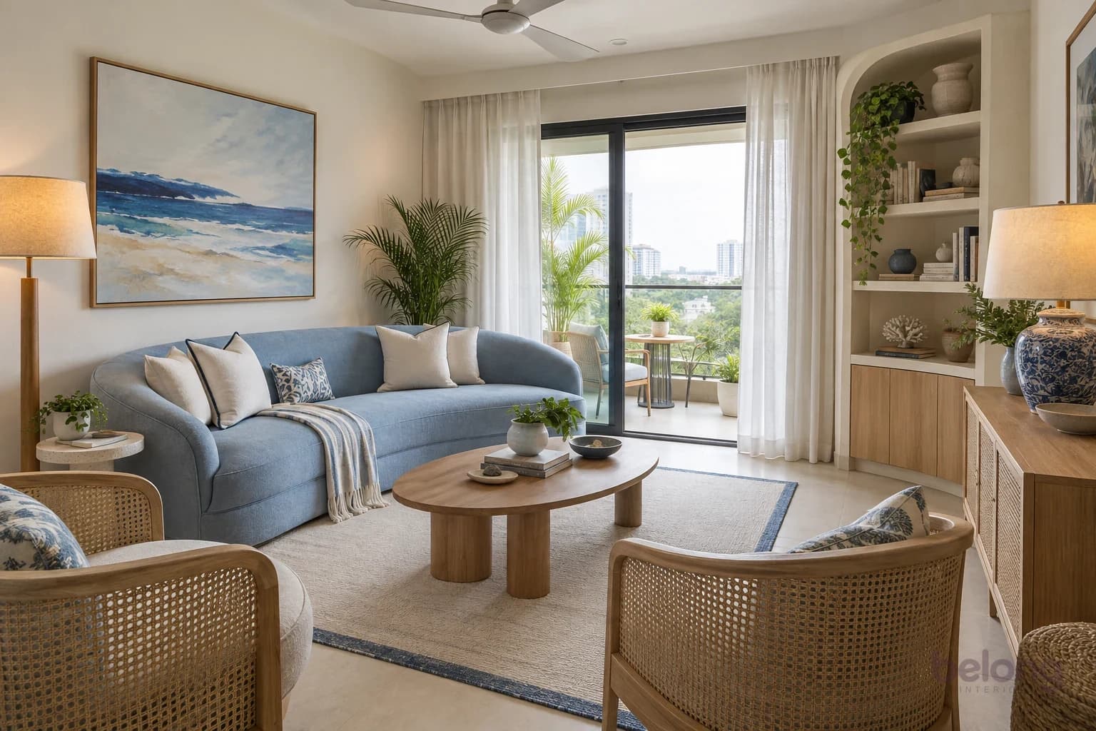
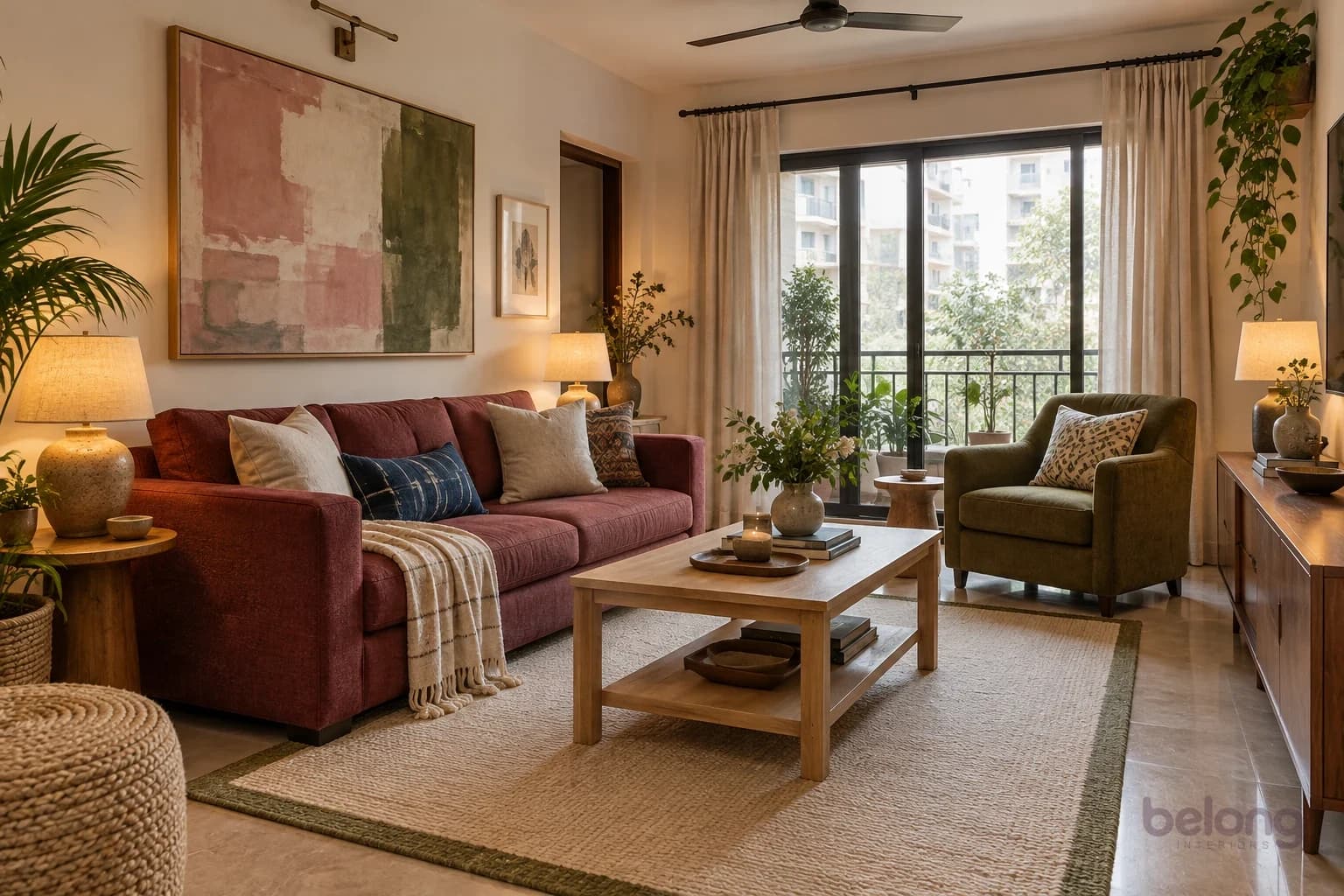
The 60-30-10 rule is the simplest way to share colour out in a room. About 60 percent goes to the main colour, usually the walls. About 30 percent goes to a second colour, carried by the big pieces: the sofa, the rug, the curtains. The last 10 percent is the accent, in cushions, art, a lamp or a vase.
It works because the eye likes a clear lead. When three colours share a room equally, they compete, and the room feels busy even when every colour is lovely. Let one colour rest, one support and one sparkle.
Treat the numbers as a feeling, not a measurement. White trims, a wooden floor and a steel almirah are neutrals and don’t count against you. And you can bend the rule: swap the roles so the bold colour goes on the walls, or let two close shades share the 60. It is there to give you confidence, not to fence you in.
The 60-30-10 room mixer
Pick a palette and watch the walls, the big pieces and the little things take their share. Then swap the roles and see the same three colours tell a different story.
- 60% WallsCream
- 30% Sofa & rugTerracotta
- 10% AccentsIndigo
Block print: walls in cream, sofa and rug in terracotta, accents in indigo.
Pick a palette
Screens shift colour a little. Use this to judge balance, then check real paint samples at home.
Let one colour rest, one support and one sparkle.
Warm vs cool undertones: why two whites can disagree
Every colour has a lean hiding under the one you can name. A white can lean yellow, pink or grey. A beige can lean pink or green. A grey can lean blue or brown. That hidden lean is the undertone, and it’s why two colours that look fine on their own can quarrel on the same wall.
Warm undertones, the yellows, reds, oranges and pinks, feel cosy, sunny and welcoming. Cool undertones, the blues, greens, greys and violets, feel fresh, calm and crisp. Neither is better. Most homes feel easiest when the walls, the floor and the big pieces share a lean, and the contrast arrives in small doses.
Try the white-paper test. Hold a paint chip against a plain sheet of white printer paper in daylight. Beside pure white, a creamy white shows its yellow, a greige shows whether it leans pink or green, and a grey gives away its blue. Compare chips in pairs too. Side by side, an undertone you couldn’t see on its own becomes obvious.
Light changes everything
The same paint can look like three different colours in one home. Daylight shifts with the direction a window faces, and lamps and tube lights add their own tint after dark. A colour you loved under the bright white lights of a shop may look quite different on your own wall.
North-facing rooms usually get steady, indirect light through the day. It is soft with a cool lean, so colours look calmer and a little deeper, and warm shades help them feel cosy. East-facing rooms are bright and fresh in the morning, then softer and cooler later on. South- and west-facing rooms tend to catch strong, warm sun, and west light turns golden in the late afternoon, which makes warm colours glow and can wash out the palest ones.
At night, the bulb decides. Warm white bulbs make colours mellow and golden, which suits bedrooms and living rooms. Cool white or daylight bulbs make colours crisper and bluer, and can make warm walls look a little flat. The box usually gives a colour temperature in kelvin: lower numbers are warmer. Whatever you choose, use the same kind of bulb within one room so the walls don’t look patchy.
Same paint, different light
Choose a paint and a light, and see how one colour shifts from a north window to a warm lamp at night.
Paint
Light
Soft white in east morning. Bright and fresh at breakfast, then softer and cooler as the day goes on. Look at your swatch twice: once in the morning, once at tea time.
A gentle illustration, not a colour-accurate preview. Your own walls, floors and bulbs will add their own touch.
Colour combinations that feel like home
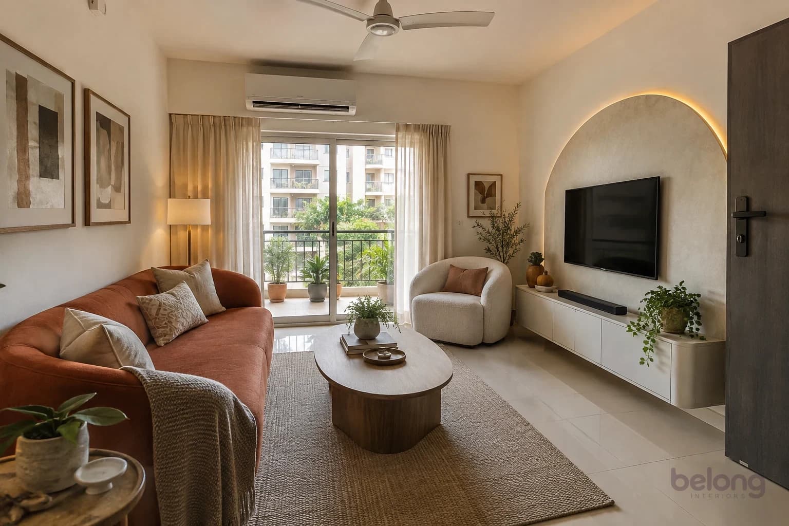
These pairings are easy to live with. Each is written in 60-30-10 order: walls, then big pieces, then accents. Cream, terracotta and indigo is warm and grounded, with a nod to block prints and clay pots. Soft white, sage and brass is fresh and quiet, and lovely in a kitchen. Blush, cocoa and oak is gentle and grown-up, never sugary, because the cocoa anchors the pink.
Powder blue, butter and walnut feels like a clear morning, and the walnut keeps it from turning babyish. Linen, olive and rust is earthy and relaxed, a good friend to wooden floors and cane. Ivory, plum and mustard is the festive one: rich and celebratory, so keep the walls calm and let a plum sofa and mustard cushions do the talking.
Two more, for when you’re feeling brave: clay, ivory and forest green, which wraps a room in warmth, and milk, raspberry and olive, where pink and green balance each other like a garden. Try any of them in the room mixer above, and notice how swapping the roles changes the mood without changing a single colour.
Across a whole flat, let one colour travel. Rooms see each other through open doors, so the terracotta of the living room sofa might return as a bedroom cushion, and the sage of the kitchen as a towel in the bathroom. That quiet thread makes a home feel planned, even when every room has a mood of its own.
Room by room: wall colour ideas for how you live
Living room. This is where everyone gathers, so choose for evenings as well as afternoons. Warm neutral walls with one confident 30, such as a terracotta sofa or an olive rug, are easy with visiting relatives and festival decorations alike. If the room doubles as a dining space, keep both under one wall colour so the flat reads as one calm space.
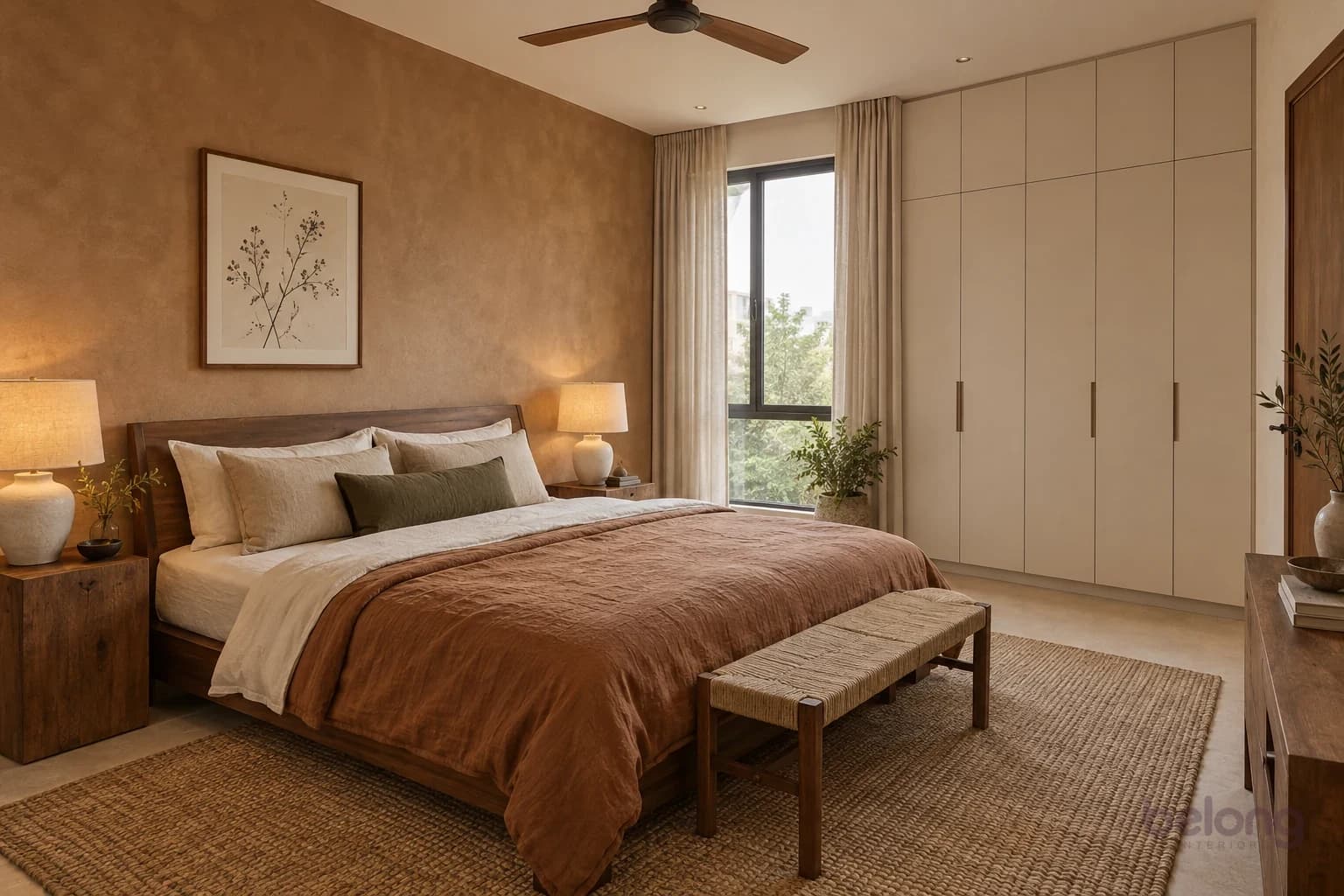
Bedroom and kids’ rooms. Soft, low-contrast colours help a bedroom wind down: muted blues, sage, warm greys and clay tones are all restful, so save the brights for a cushion you can swap. Look at bedroom wall colours lying down, from the bed, with the lamp on. In a child’s room, keep the walls calm and let the child choose the 10 percent. Posters, bedding and a painted shelf can change as they grow, while the walls stay.
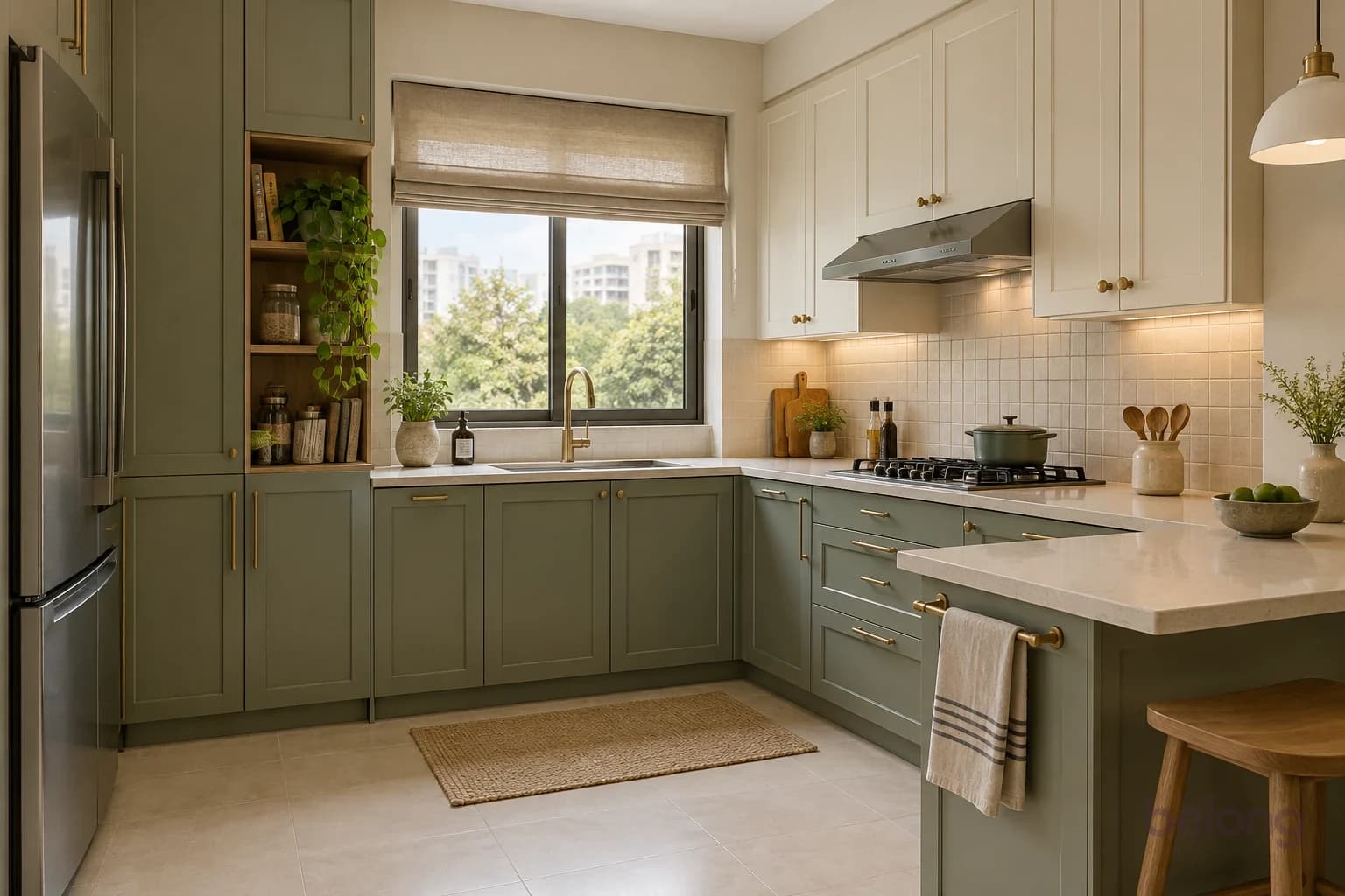
Kitchen. The cabinets often carry the colour, so pick the shutter first and let the walls go quiet around it. Sage, soft blue and butter all feel clean beside steel dabbas and a busy counter. Choose a wipeable finish near the cooktop and the dining table, where splashes and little hands will find it.
Pooja corner and small rooms. Many families like warm, gentle colours for a pooja corner, such as ivory, sandalwood, soft gold or pale saffron, often in a niche that glows under a small light. In a small room, light colours bounce more light around, but one soft mid-tone on the walls and trims can blur the corners and feel cosy rather than cramped. Either way, avoid cutting a small room into many colours.
Accent wall or colour drenching?
An accent wall puts a stronger colour on one wall and keeps the rest quiet. It is a gentle first step and easy to repaint. Choose the wall your eye lands on naturally, often behind the sofa or the head of the bed, rather than the window wall, where the bright view makes any colour look darker and harder to read.
Colour drenching goes the other way: the walls, the trims, sometimes the ceiling and even the doors, all in one colour or close shades of it. It sounds dramatic, yet it often feels very calm, because there are no hard edges for the eye to stop at. It suits small rooms, bedrooms and studies, and it quietly hides awkward beams and uneven corners.
Somewhere in between is tonal colour: three shades of one family, lighter on the walls and deeper on a cupboard or a niche. If you can’t decide, start with an accent wall. If you find yourself wishing the colour went further, that’s your answer.
Paint finishes for walls, ceilings and trims
The finish, or sheen, changes how a colour looks and how it copes with daily life. Matt has almost no shine, so it hides bumps and patchy plaster and makes colour look soft and deep. Eggshell and satin have a gentle glow and wipe clean more easily. Semi-gloss is shinier and tougher, made for the doors, frames and grills that hands touch every day.
As a rule of thumb, the more a surface is touched, splashed or scrubbed, the more sheen it can take. Many brands also make washable matt paints, which give you the soft look with easier cleaning. Names vary from brand to brand, so compare the sheen on a painted sample, not just the words on the tin.
Ceilings are usually best in flat white or a very pale version of the wall colour, which keeps light even and hides joins. Trims and doors can match the walls for a calm, drenched look, or sit in a soft white for a crisp edge. And fix damp first: in the monsoon, paint over a damp patch simply bubbles and peels again, whatever finish you choose.
Which finish, where?
Pick a room or a surface to see the sheen that suits it, and the trade between hiding bumps and wiping clean.
Room or surface
Living room walls
Matt, or a washable matt
- Matt (suggested)
- Eggshell
- Satin
- Semi-gloss
- Hides bumps
- 4 of 4
- Wipes clean
- 1 of 4
Why: Soft, low-glare colour that hides uneven plaster when light rakes across the wall.
Watch for: By switches and dining chairs, a washable matt or eggshell copes better with hands.
Finish names and washability vary between brands. Compare painted samples, not just the words on the tin.
Test it before you commit
Buy sample pots of your top two or three and paint big swatches, roughly the size of a newspaper page, with two coats. Better still, paint them on sheets of chart paper so you can move them around. Leave a white border around each one, because the old wall colour changes how you see the new one.
Put the swatches on two different walls: one near the window and one in the darker corner. Look in the morning, in the afternoon and at night with your usual lights on. Check them beside the floor, the sofa and the curtains you’re keeping.
Then live with them for a few days. The colour you keep stopping to look at, in a good way, is usually the one. Colour often looks stronger across a whole wall than on a small card, so when you’re torn between two shades, the softer one is usually the safer choice.
If you’d like a second pair of eyes, Belong can help you build a palette for the whole home around the things you love, so every room feels connected and completely yours.
Questions, answered
What is the 60-30-10 colour rule?
It is a simple way to balance colour in a room. About 60 percent goes to a main colour, usually the walls, 30 percent to a second colour in big pieces like the sofa, rug and curtains, and 10 percent to an accent in cushions, art and small things. Treat the numbers as a guide, not a measurement.
Which colour combination is best for a living room?
The best one suits your floor, your furniture and your light. Easy starting points are cream with terracotta and indigo, soft white with sage and brass, or linen with olive and rust. Keep the walls as the calm 60 and put stronger colour into the sofa, rug and cushions.
What colours are good for bedroom walls?
Soft, low-contrast colours such as muted blue, sage, warm grey, clay or a warm off-white help a bedroom feel restful. Check the colour at night with your bedside lamp on, since that is when you will see it most. Keep brighter colours for bedding and cushions you can change.
How do I know if a paint colour has a warm or cool undertone?
Hold the paint chip against a sheet of plain white paper in daylight. Beside the white, warm colours lean yellow, red or pink, and cool colours lean blue, green or grey. Comparing two chips side by side also makes each undertone easier to see.
Which paint finish is best for interior walls?
Matt or washable matt suits most living room and bedroom walls because it hides small flaws and looks soft. Eggshell or satin wipes clean more easily, so it suits kitchens, kids’ rooms and busy passages, while semi-gloss suits doors, frames and grills. Ceilings are usually best in flat matt.
How does sunlight change how paint looks?
North-facing rooms usually get steady, cooler light that makes colours look calmer and a little deeper. South- and west-facing rooms tend to get strong, warm sun that makes warm colours glow and can wash out pale ones. Always test large swatches in the room itself, in the morning and the evening.
Every home is different. These notes are a starting point for your own brief, with the details shaped around your space and the people who use it.
Thinking of someone who’d like this?
Send it to the people you’re planning with, or keep it on your reading list.